Towards a more perfect link underline
progress in underline text-decoration in Safari and iOS
Marcin Wichary wrote an excellent post about creating the ideal text underline in CSS for Medium. In that post, Wichary offers a list of goals to achieve:
So, the ideal technological solution would allow us to:
- change the width of the line (with additional half-pixel/retina support),
- change the distance from the text,
- change the color (even if just to simulate thinner width by using lighter grays instead of black),
- clear the descenders,
- (perhaps) have a separate style for visited links.
Wichary goes on to detail Medium’s solution, which uses a CSS background-gradient to fulfill the first three goals in his list, but does not separate character descenders (e.g. the part of a letter that descends below the baseline) from the underline.
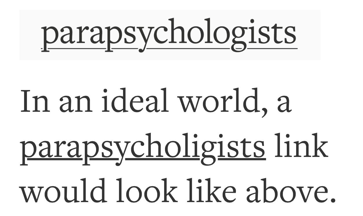
Since the writing of that post, Apple released Safari 8.0 and Safari for iOS 8, which modifies the rendering of the venerable text-decoration: underline property to fulfill Wichary’s fourth goal by clearing the descenders. I grabbed a screenshot of Wichary’s ideal vision with the way the same word as a link is rendered in Safari 8.0:

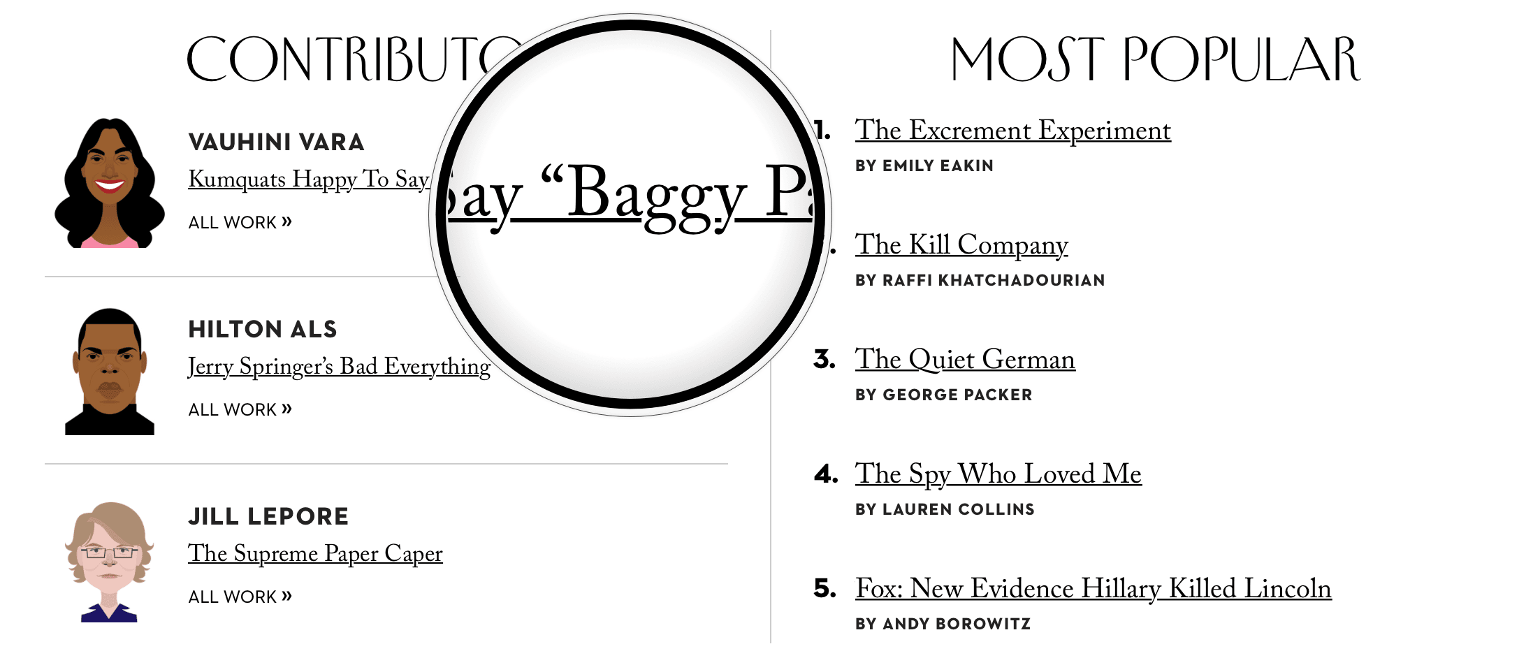
You can see another example of the native Safari underline in the screenshot at the top of the page, from The New Yorker (with modified text content to illustrate descenders). Overall, the underline is much thicker than Wichary’s ideal and sits too close to the text for my comfort. But most damningly to my mind, the underline does not change weight to adapt to the weight of the font, leading to unfortunate mismatches like with the :hover style on Angel List:

In that example, those fat underlines are sitting right underneath text rendered with font-weight: 100. All of which is to say that there is plenty of room for the use of custom text underlines to improve the readability and aesthetics of links in WebKit, not to mention every other browser. Still, I have been frequently delighted by the change in rendering, particularly because any app using a WebView automatically gets the newly cleared descenders. Underlined text in my mail applications and elsewhere now looks cleaner, more readable, and less cluttered.
But if you still desire the extent of control that Wichary hopes for, give the linear-gradient background trick a try. Accompanied with three text-shadows positioned to the left and another three to the right of the link text in the color of your background, you even get nicely cleared descenders. And you can vary the weight and distance of the underline depending on the weight and size of the text. I have been able to use that technique to nice effect in my Pesto stylesheet, which I use for previewing Markdown files in apps such as Marked 2. I made a codepen demo to illustrate my custom underline implementation and make it easy to compare them to their native browser counterparts. The technique has some gotchas (browser inconsistencies in retina vs non-retina and ugliness with text selection), but I’ve been able to address all of the issues that I have so far uncovered. I’ve embedded the demo below. Use the button to toggle between the default browser underline and my custom one, and find the CSS that powers it under the SCSS tab.
See the Pen Towards a more perfect link underline by Andrew Patton (@acusti) on CodePen.